Every couple dreams of a wedding day that is unique and creative. Colours play a huge role in enhancing the overall mood and effect of this special day. Unfortunately, choosing the right colours for your wedding isn’t as easy as it seems. Although you may have specific favourite colours, you cannot simply put them together and plan your wedding around them.
Wedding colour pitfalls are pretty standard, and they ruin the wedding ambiance. Fortunately, being aware of the likely mistakes will help you avoid them. Here is our guide to the common mistakes couples make when choosing wedding colours. Use it to steer clear of a visual overdose of colours and mix and match combinations that do not gel together.
Table of Contents
Ignoring the colours in your venue
Many couples forget to account for the colours that are part of the venue they choose. This unavoidable part of the décor has to be considered, and you should work it into the wedding colour palette. Since it is unlikely that you can alter any of the actual colours at your venue, it is wise to pick colours that do not clash with them for the best effect.
If you already have made your decision about the colours that will be in your wedding, choose a venue with colours that work with your choice. There are many venues without dominating colours in the décor. Pick such platforms, and you will not have to worry about a likely clash of colours. Otherwise, find your wedding venue first. Then pick your wedding colours to go with it. However, this means that you will have to be open to options and flexible with your choices.
Choosing several distinct colours
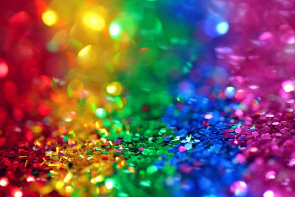
When you are a lover of colours, it can be challenging to narrow down your choices to just a few. Nevertheless, don’t make the mistake of working with many colours that are entirely different. Multiple bold and dominating shades create clutter and look messy. Also, the individual details will be lost in the noise.
This article on the Brides website suggests that where colours are concerned, fewer is better. If your theme requires you to work with multiple colours, say like a rainbow or circus theme, try to work with smaller doses of colour. Then use a neutral base to tie the effect together. This article also suggests limiting your colours to just two for elegance and sophistication. Make sure that these colours complement or contrast for it to be pleasant and not overbearing. As a general rule of thumb, please do not add more than four colours to your palette, or it can become overwhelming.
Going with the trend
Pantone picks a colour or two every year, and many brides decide to incorporate this into their weddings. From burgundy to rose quartz and greenery, the choices are often unusual and unexpected. This may seem to be unique and exciting at the time. One advantage of using these colours is that it is easy to find your wedding decorations. Many companies bring out décor items in this colour following the announcement every year. However, not all such trends are timeless or classic.
When you choose an unexpected combination for your wedding, it is likely to look dated over time. Although it may look enjoyable at the moment, remember that your wedding memories should stand the test of time. When your album shows what is hot now, it doesn’t have to be the same years later. Hence, it is better to pick colours that appeal to you than go with fads that disappear soon. Classic colour combinations and bold, saturated colours will always speak to you. Ten years from now, when you open your wedding album, the colours that you eternally love will seem more attractive than shades whose names you can barely remember at the time.
Keeping your palette too simple
This is the very opposite of working with too many colours. By limiting your wedding day palette to just one or two shades, your wedding can become monotonous and boring. Instead, try to incorporate various hues of the same colour into the scheme. Also, work with neutrals that don’t overpower their presence.
If your focal colours are vivid, balance the effect with soft, neutral shades that add depth to the primary colours. If you have chosen mute and subtle colours to be highlighted, the correct dose of complementing colours will change your personality and make the décor more interesting. Take a look at the colour wheel to find colours that contrast or complement your chosen primary colours. Use this to plan your colour combinations wisely. Take a look, and we are sure you will find plenty of inspiration and ideas.
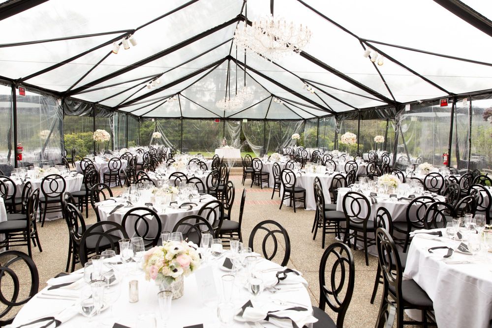
Choosing familiar and predictable combinations
Specific colour combinations are safe. However, they are also dull. We have seen enough weddings where black has been paired with white and gold or red with yellow and white. These predictable combinations no longer excite and have little scope for creativity. So, while you should find inspiration in traditional varieties, it is a good idea to tweak the colours and your creative twist.

One of the ways to do this is to take such a palette and switch out one of the colours. Choose a hue from the same colour family, but a distinct one. Another option is to break the pattern with luxurious doses of white or black, creating a sophisticated effect. You can also use metallic colours for an exciting development. The proper amounts of gold, silver or copper can instantly glam up a colour palette and add to its elegance.
Trying too hard to get perfect matches
While carefully matched colourful pieces will look stunning in your wedding décor, they should flow naturally and look effortless. Trying too hard to get the colours right and the combinations perfect will ruin the entire effect. This is especially true where floral elements and bridesmaids’ dresses are concerned. It may not be possible to find flowers in the exact colour you want for your wedding palette. You may end up having to spend extra for off-season varieties if your chosen colour is rare, like shades of blue.
Similarly, picking bridesmaids’ dresses in colours that match your palette isn’t a good idea if it won’t look good on your bridesmaids. This will not only make them unhappy, but it will also be an eyesore. The trick is to think creatively and make these details work with a bit of flexibility. For example, choose décor items like ribbons, balloons or candles to replace flowers, but obtain the intended effect. Similarly, dress up your bridesmaids with accessories like sashes, hair clips or even shoes to add the desired pop of colour without ruining the effect.
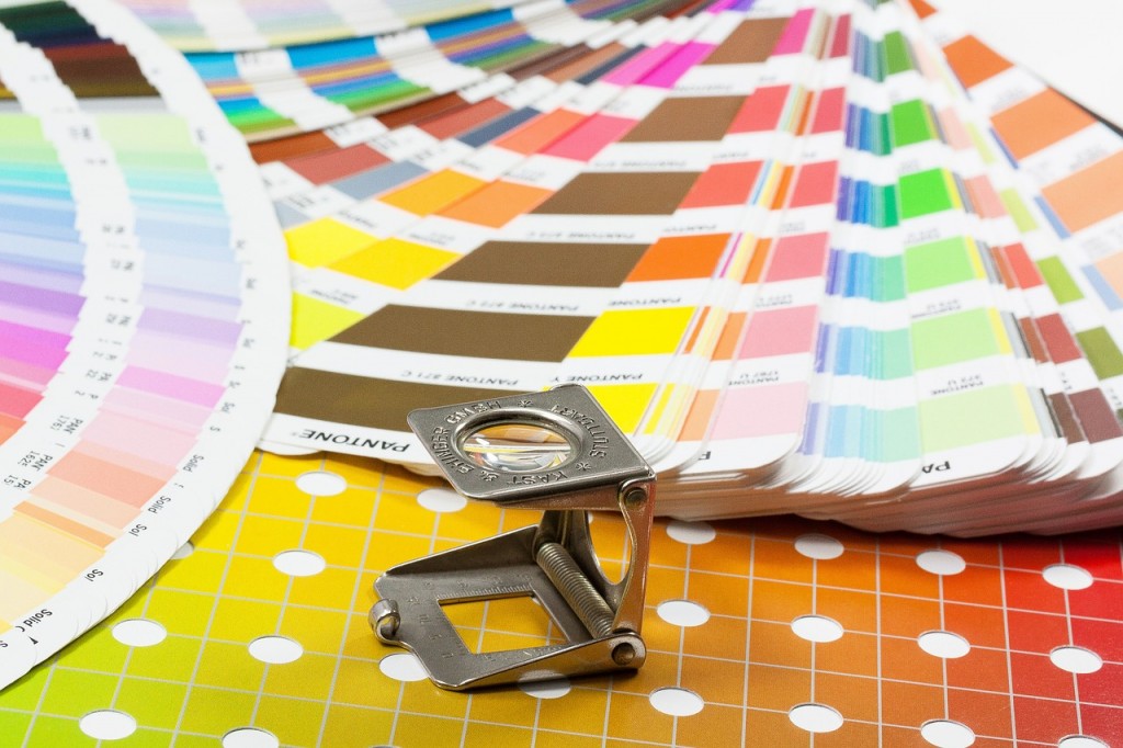
Choosing colours without actual visual samples
Whether it is your wedding flowers, table linen, invitation suite or bridesmaids’ dresses, always see the colour to determine it is alright. However, images of the paint on a computer screen or in a magazine can be entirely different from how it looks in person. This is because the colour you see on a screen depends on the light in which the image was taken and any edits that went into creating the image.
If you follow this route, it can completely alter the final effect you obtain at the end. For instance, peach or coral may turn out to be pink or orange when viewed directly. Since you will have to match your colours across various aspects of your wedding, it is best to consider swatches before deciding. This way, you can see for yourself if the colour is exactly as you intended, and make the right choice. Also, names can be misleading. So, make sure you have a sample of the colour to show others, so there is no confusion about what you mean.
Not considering the effect of texture
The same colour can have different effects depending on the texture of elements used. For example, heavy-text items can have saturated effects, while wispy textures reduce the drama associated with a colour. Keep this factor in mind when choosing wedding colours.
Patterns, prints and embellishments can alter the overall effect of colour. When planning your décor and style, consider how the different textures in the arrangement come together. The proper distribution of surfaces will enhance the depth and drama of designs in your décor. In addition, pay close attention to linens, centrepieces, carpets and wall colours. These are a significant part of visual imagery and play an essential role in determining the overall effect.
Using colours that are garish
Some colours are too challenging to look at and may not be ideal for your wedding décor. These are colours that aren’t usually seen in nature. Neons and fluorescent colours are distractive and not easy on the eye. Avoid such colours or use them in moderation, so your décor isn’t tacky.
Neons can be overwhelming unless chosen carefully. However, it is possible to get the effect right if you use them sparingly. If you choose such colours in your wedding imagery, balance them with neutrals and complementary colours that make it less overwhelming. Limit their use and consider the effect of the lighting in the space to get it right. For example, neons and fluorescent colours will look better in the evening than during the day. So, make such colour choices keeping these factors in mind.
Take a look at this article on the Glamour website for some unique and impressive ideas.
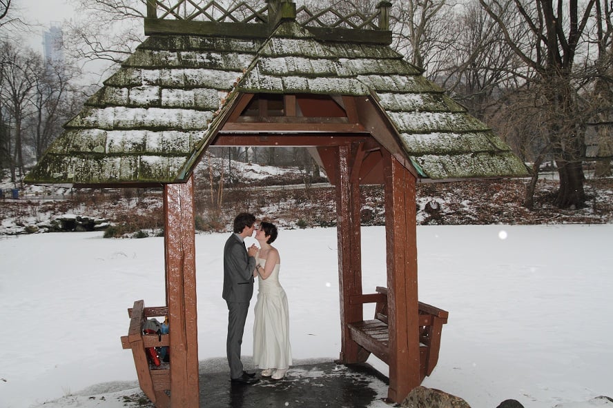
Not considering the effect of the climate and actual ambiance at the time
There is no denying that different colours look best at certain times of the year than others. Bright tropical colours, for instance, look best in summer and spring, while bold, dramatic colours look stunning in autumn and winter. Matching the colours to the actual environmental condition can bring out the best effects in them. Use this factor when choosing your wedding palette.
Set the right tone for your wedding by choosing colours that work with the atmosphere you aim to have at your wedding. This doesn’t mean you shouldn’t use colours like yellow and orange at a winter wedding scene. Instead, you may have to lighten or intensify the saturation of the colours you choose to suit the scenery. Also, pick accent colours that will complement your primary choices, as this can significantly change the mood created.
Choosing wedding colours isn’t easy. The options are endless, and it isn’t easy to narrow down choices to a few when there are so many attractive options. With each passing day, the ideas keep growing, and this only makes the task more difficult.
There are many sources of inspiration too. If you look at the internet or flip through a bridal magazine, you will see a stunning variety of ideas. So, how do you make the right choice? As with everything in your wedding, your wedding colour palette should reflect your personality, preferences and style in general. Look around you and to your home and wardrobe as the starting point. This will help you identify colours, textures and prints you already love. Then, use it to narrow down your choices and go with what your instinct points you to. The most important thing is not to overthink it and be happy with what you settle on.
We would love to know what colours and ideas you used when planning your wedding. Let us know in the comments section below.
Stay tuned to the Best for Bride website for updated offers and deals that will help you have a fantastic wedding day. Also, don’t forget to visit this page regularly for more advice, inspiration and ideas to plan the perfect wedding day.

Summary: Mistakes to Avoid When Choosing Wedding Style and Colors
- Rushing the Decision:
- Avoid rushing the decision of choosing your wedding style and colors. Take your time to explore different options and consider your preferences and wedding theme.
- Ignoring Venue and Season:
- Consider the venue and season when selecting your wedding style and colors. Ensure that they complement the surroundings and create a cohesive look.
- Overwhelming Color Palette:
- Avoid choosing too many colors for your wedding palette, as it can lead to a chaotic and disjointed appearance. Stick to a few main colors and incorporate them harmoniously throughout the decor.
- Neglecting Cohesion:
- Aim for cohesion between your chosen wedding style, colors, and overall theme. Ensure that they all align and create a unified and harmonious atmosphere.
- Failing to Communicate:
- Communicate your chosen wedding style and colors with your vendors and wedding party to ensure everyone is on the same page. Clear communication will help execute your vision flawlessly.
- Ignoring Personal Preferences:
- While it’s essential to consider popular trends, don’t ignore your personal preferences. Choose colors and a style that reflect your personality and taste to make your wedding truly unique.
- Forgetting About Guests’ Comfort:
- Consider your guests’ comfort when choosing colors for decor and seating. Opt for soothing and inviting colors that create a warm and pleasant ambiance.
- Disregarding Color Symbolism:
- Be mindful of the symbolism behind certain colors. Avoid colors that have negative connotations or clash with the overall atmosphere you want to create.
- Overlooking Visual Balance:
- Achieve visual balance by incorporating different shades and tones of your chosen colors. Balance brighter hues with softer accents to create an aesthetically pleasing and balanced look.
- Not Seeking Professional Advice:
- If you’re unsure about choosing the right wedding style and colors, don’t hesitate to seek professional advice from wedding planners or designers. They can provide valuable insights and guidance.
FAQ – Choosing Your Wedding Style And Colours
What is the maximum number of colours a bride should choose?
Unless you’re trying for an ombre or neutral effect, the general rule is to stick to a maximum of three colours. As a finishing touch, add a metallic hue to your pallet. If you combine more than three distinct colours in your wedding, it will be a riot.
What colour is the most popular for weddings?
Dark blue was the most favoured colour for individual weddings. According to our research, 37% of couples who exchanged vows picked deep blue as their wedding day colour. This attractive colour was a perfect complement to any wedding theme or style, from navy or dusty blue bridesmaid gowns to royal blue jackets.
What is the lucky wedding colour?
The bride is said to be lucky if she wears royal and vibrant colours like gold, yellow, orange, and red. Gold and yellow are associated with creativity, happiness, glamour, and refinement. Women’s confidence is symbolised by orange, whereas power is symbolised by red.


For my wedding, I think that I would like to see the tables filled with colors that do not match up well. Thank you for the tips.
Great tips! Thank you so much for the insight. Being creative with themes and colors is not my strong suit!
Mistakes to avoid when choosing your wedding style and colours…Good tips but not for me. Although the variant with a “game” of colours or a choice of non-standard combinations. I liked! Still, the wedding by the rules and trends! Well, no, it’s not for me! Breaking down the stereotypes! Combine the incompatible! If the wedding dress, it will be a white shirt and jeans. If makeup, then, with black eyeliner. If flowers…no…better without flowers…let them live.
I like your tip that textures can enhance the depth of your décor. My sister is getting married soon and loves the outdoors so I think that the wood textures should play a big part in the decorations. Thank you so much for the helpful tips on wedding decorations!
It’s so amazing wedding style color for the big day.